
Data Visualization with curaJOY
Project Type: Web application
Team: Natalie Codina (UX Designer) & Eunkee Min (UX Designer)
Role and Responsibilities: Lead Project Designer responsible for defining project goals, establishing clear design expectations, and serving as the primary liaison between stakeholders and the design team. Collaborated with stakeholders to align on project requirements and contributed to determining the final designs implemented.
Duration: 5 weeks
Tools: Figma
Methods: Secondary research, interviews, competitive analysis
The Challenge
curaJOY aims to help users develop emotional intelligence and resilience through behavior tracking and mood check-ins. However, while users were collecting significant data about their mental and emotional well-being, they struggled to gain actionable insights from it. Without a clear way to visualize trends or understand the long-term impact of their actions, users feel overwhelmed and disengaged from their wellness journey.
Key Questions:
How can we simplify complex mental health data while maintaining accuracy?
What insights and features will motivate users to take meaningful, personalized actions?
How can we highlight long-term behavioral patterns to support users’ emotional growth and self-reflection?
In what ways can we design an engaging and supportive experience that encourages consistent user interaction without overwhelming them?
The Solution
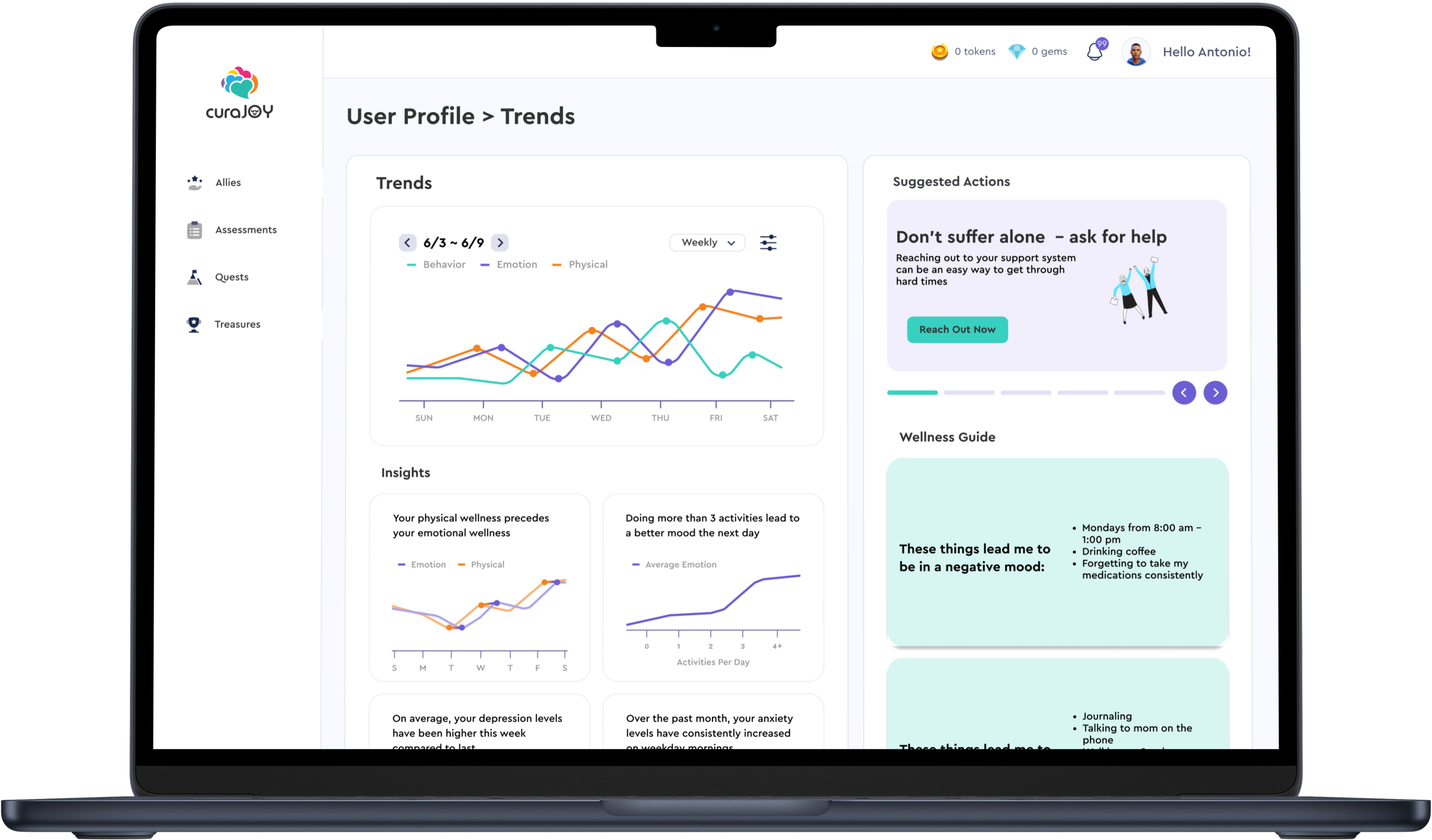
We created a comprehensive data visualization page that empowers curaJOY users with valuable insights from their mood and behavior check-ins.
Page Features:
Graph of Recent User Trends: A snapshot of the user's recent mood and behavior, allowing for quick self-reflection.
Insights into User Data: Similar to the "Apple Health" app, users can view trends in mood and behavior, including short-term fluctuations and long-term patterns.
Long-Term Wellness Guide: Personalized insights into patterns such as peak anxiety times, activities that affect mood, and triggers, helping users connect their actions with emotional outcomes.
Carousel of Suggested Actions: After viewing their data, users can scroll through personalized recommendations for activities or behaviors to improve their mental and emotional state.
This design bridges the gap between data collection and self-improvement by making mental health data more digestible, actionable, and personalized.
Scroll down to learn more about how we made these designs come to life
Research
Before diving into the design process, we conducted thorough research to inform our approach and ensure the data visualization page would be meaningful for users.
Secondary Research: We explored academic articles and online resources to understand the types of data commonly collected by therapists and mental health professionals. We analyzed intake forms, mental health surveys, and behavioral tracking methods to identify which data points were most relevant to users' emotional well-being and mental health trends.
Interviews: We conducted interviews with therapists and behavioral analysts to deepen our understanding of the data that is most valuable for tracking and improving mental health. These interviews provided critical insights into the types of questions that could reveal behavioral patterns, emotional triggers, and the impact of various interventions.
Competitive Analysis: To understand how other platforms visualize and present mental health data, we reviewed competing mental health and wellness apps. This analysis helped us identify industry standards, pinpoint gaps in existing data visualizations, and discover opportunities to differentiate curaJOY by offering more actionable insights and long-term trend tracking.
This research provided a solid foundation for our design decisions, ensuring that the data we chose to visualize was both relevant and impactful for curaJOY users.
Problem Statement
“How can we design an intuitive and engaging data visualization experience that helps curaJOY users easily understand their mood and behavior trends over time, while also providing actionable insights to improve their mental and emotional well-being?”
Ideation
Using the information we got from our research, we decided to create a page for users that had simplified data that was important to them. This included:
Simplified ways to view current trends using simple graphs and plain English explaining trends to them
A more lasting data section that shows their “wellness guide”, aka lasting patterns of behavior that they can reference back on time and time again
An action carousel to allow users to choose actions to take based on the data they just viewed
Key Feature: Action Carousel
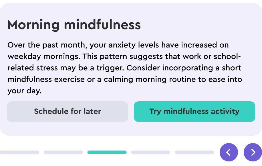
While simply understanding data is important, we also asked ourselves, “How can users turn these insights into meaningful action?” Viewing trends in mood and behavior is valuable, but without guidance on what to do next, users may feel stuck or overwhelmed. To bridge the gap between awareness and action, we introduced the Action Carousel—a dynamic feature designed to provide users with personalized, actionable suggestions based on their data.
The Action Carousel presents a scrollable set of cards offering relevant activities tailored to the user’s current emotional state. For example, if a user’s data indicates increased anxiety, the carousel might suggest journaling, a method previously shown to help them feel calmer. Each suggestion is paired with a clear call-to-action button, such as “Journal Now”, which immediately opens a guided journaling prompt.
By integrating this feature, we transformed passive data observation into proactive self-care. The Action Carousel empowers users to take immediate, personalized steps toward improving their mental well-being, making their data not just informative—but truly actionable.
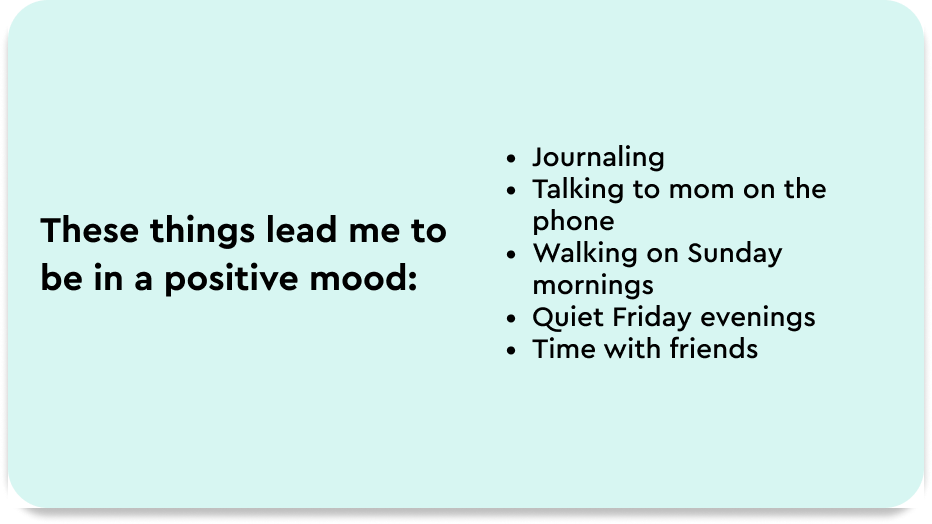
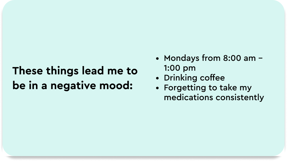
Key Feature: Wellness Guide
When considering what kind of data would be helpful for users to see, we also asked, “how useful is this data for users?” In answering this, we found that while short term data can be useful to give users motivation to continue to be consistent, it doesn’t show growth over time. This is a major problem because curaJOY’s purpose lies primarily in allowing users to grow mentally and attain better habits. Therefore, this page should also display users' long term data, not merely the frequency of user check-ins and activities.
This is how our idea of the wellness guide came to life. The wellness guide captures users’ long term data and repeated patterns of mood or behavior, allowing them to make smarter choices based on these patterns. For example, let's say a user repeatedly logs that they feel anxious on Monday mornings. Being able to identify this pattern is a key part of mental health help that would often be given by a therapist. The wellness guide will also aim to identify positive coping mechanisms that users can reference time and time again.
Wellness Guide Examples
Key Takeaways
Data should drive action: Simply displaying data isn’t enough anymore; users need insights that guide meaningful decisions. Many health and wellness apps rely on basic graphs that show task completion but fail to provide deeper understanding for their users. This project allowed me to understand the importance of transforming data into actionable insights. By introducing the Action Carousel and Wellness Guide, we helped users connect their behavioral patterns to practical steps for improving their mental well-being.
Balancing accuracy and simplicity is integral to data design: Effective data visualization requires balancing detailed, accurate information with clear, digestible presentation. Overly complex data overwhelms users, while oversimplified data can lose meaningful insights. This project taught me that achieving both accuracy and simplicity requires careful balance.
Designing with empathy makes all the difference: Throughout this project, I realized that designing for mental health isn’t just about clean layouts and sleek graphs—it’s about empathy. Understanding how users feel when engaging with their personal data helped me create a more supportive and encouraging experience. This meant going beyond visuals to design features that feel human, like personalized action steps and relatable wellness insights. It reminded me that thoughtful design can make users feel understood, instead of overwhelmed.
If I had unlimited time, money, and resources, here’s what I would do differently…
Seamlessly integrate data visualization across all pages: Collaborate with designers from other sections to incorporate relevant data cards throughout the platform, rather than confining insights to a single page. Data should be a constant, accessible part of the user experience—helping users stay informed without needing to seek it out. By strategically placing visualizations in contextually relevant areas, we can make insights more actionable and seamlessly woven into the user journey.
Enhance the connection between short-term and long-term data: While the wellness guide captures long-term trends like habit formation and mood improvements, it doesn’t fully illustrate the relationship between short-term experiences and long-term growth. I would like to invest in deeper research and implementation strategies to help users see these connections more clearly. For example, how do daily interactions with curaJOY—such as completing quests—affect immediate mood shifts? And how do those cumulative short-term changes translate into long-term progress? Strengthening this link would empower users to make more informed decisions about their wellness journey with curaJOY.